Web Components
Unit uses web components to allow simple integration that is platform and framework agnostic. The components work seamlessly on both desktop and mobile, and support all modern browsers.
Web components run in a shadow DOM, which encapsulates Unit Code from your app and makes sure the components don't impact the behavior of the host app, and vice versa.
The project is being built with performance and accessibility in mind, and complies with modern standards such as Core Web Vitals. The components are covered by end-to-end automated tests.
Installation
Import the Unit Web SDK by adding a <script> tag at the head of your HTML page. The SDK is available in two bundle formats:
| Format | File | Description |
|---|---|---|
| ES Module (Recommended) | components.es.js | Entry module with on-demand code-splitting. Only the chunks required by the components on the page are fetched. |
| IIFE | components.js | Single monolithic script. All code loads upfront. |
ES Module Bundle (Recommended)
The ES module build uses code-splitting â only a small entry module is loaded initially, and additional chunks are fetched on demand as components are rendered. This results in faster initial page loads, better caching through content-hashed chunks, and on-demand loading of components that aren't yet in use.
For production use:
<script type="module" src="https://ui.unit.co/release/latest/components.es.js"></script>
For sandbox use:
<script type="module" src="https://ui.s.unit.sh/release/latest/components.es.js"></script>
- The
type="module"attribute is required. Without it, the browser will fail to parse the ES module syntax. type="module"scripts are deferred by default â no need for theasyncordeferattributes.- Chunks are resolved relative to the entry URL automatically â no additional configuration is needed.
- Everything else stays the same: same web component tag names, same attributes, same events.
Extended Bundle
Some components â such as the White-Label App and Application Form â are not included in the main bundle due to their additional size. Use the extended bundle to embed these components:
<script type="module" src="https://ui.unit.co/release/latest/components-extended.es.js"></script>
For sandbox, replace ui.unit.co with ui.s.unit.sh.
IIFE Bundle
The IIFE bundle is a single monolithic script that loads all code upfront. It is available for legacy browser support or environments where ES modules are not suitable.
For production use:
<script async src="https://ui.unit.co/release/latest/components.js"></script>
For sandbox use:
<script async src="https://ui.s.unit.sh/release/latest/components.js"></script>
The extended IIFE bundle is also available at components-extended.js.
Do not load the IIFE and ES module bundles on the same page. Loading both would register the same custom elements twice and cause errors. Pick one format per page.
Versioning
The SDK follows a semantic versioning numbering scheme. Both the IIFE and ES module bundles are published at every release â patch, minor, and major.
All versions are hosted on our CDN and are accessible at:
| Environment | ES Module (Recommended) | IIFE |
|---|---|---|
| Sandbox | https://ui.s.unit.sh/release/X.Y.Z/components.es.js | https://ui.s.unit.sh/release/X.Y.Z/components.js |
| Production | https://ui.unit.co/release/X.Y.Z/components.es.js | https://ui.unit.co/release/X.Y.Z/components.js |
The same URL patterns apply to the extended bundles (components-extended.es.js / components-extended.js).
Version Resolution Strategy
The latest version is available on https://ui.s.unit.sh/release/latest/components.js or https://ui.unit.co/release/latest/components.js, and the version number will appear on the first rows of the file with the following text:
* @license Unit White-Label UI Components
* unit-web-sdk X.Y.Z
While it's possible to work with the latest version, developers may choose to use a specific one, or by using one of the following ways:
-
It's possible to fetch the recent version of a specific minor by specifying the minor version only (X.Y). for example: if we had versions 1.0.0, 1.0.1, 1.1.0, 1.2.3 and the script src that was defined is
https://ui.s.unit.sh/release/1.0/components.js, the file version that will be returned is 1.0.1. -
In the same manner, it's possible to fetch the recent version of a specific major by specifying the major version only (X). for example: if the latest version is 1.2.3 and the script src that was defined is
https://ui.s.unit.sh/release/1/components.js, the file version that will be returned is 1.2.3.
This allows developers a flexible approach for receiving updates, bug fixes and design adjustments, but also enables a way to use a specific version, and opt-in to newer versions later.
â NOTE
We recommend specifying the latest minor version (for example:
2.0) and leaving out the last part of the version to make sure you get the latest patch and bug fixes. The latest version is specific in the changelog.
Release Cycle
Our release cycle allows for frequent patch updates for bug fixes and internal improvements, UI changes are to be avoided on these versions.
Minor versions will be released every week or two and will include any non-breaking change to current components, or a release of a new component. New flows for current components may be introduced, and a web-component attribute (allow-new-component-feature="true") will be introduced to allow developers to opt-in to using it.
Major versions are seldom released and their changes are planned and announced ahead of time, these may introduce breaking changes or a major UI revamp.
Authentication
To learn more about authentication and customer tokens, please refer to the authentication and customer token guide.
Events
The web components fire Custom events to let you know of any customer activity taking place within each component.
The events can be used for:
- Having your app react to changes originating from the component (for instance, if a card gets closed, you may want to redirect the client back to the home screen).
- Managing your own analytics on customer usage patterns.
- Sending commands to the component (for instance, you can tell the card component to freeze the card by sending an event).
Web components that interact with the Unit API will emit custom events to the window object upon completion of any HTTP requests. These events come with a promise object that represents the outcome of the request. The promise will be resolved if the request is successful, providing access to the response data. If the request fails, the promise will be rejected and the error can be handled through the catch method. This feature allows for efficient handling of the request-response cycles within the web component, without having to manually handle the promises returned by the API.
window.addEventListener('unitCardStatusChanged', async function (e) {
	e.detail
		.then(function (data) {
			console.log(data);
		})
		.catch(e => {
			console.log(e);
		});
});
On load event
The unitOnLoad event is a custom event that is fired by the web component once it has finished loading and is ready to be used. In order to listen for this event, you need to add an event listener to the desired component using the addEventListener method.
The event listener function will be called with an event object as its parameter, which contains information about the event.
document
	.querySelector("unit-elements-card[card-id='632197']")
	.addEventListener('unitOnLoad', function (e) {
		console.log('Component loaded', e.detail);
	});
Error handling
In case of an error during the loading process, the onload event will be fired with an error message. The error message will be passed as the detail property of the event object.
document
	.querySelector("unit-elements-card[card-id='632197']")
	.addEventListener('unitOnLoad', function (e) {
		if (e.detail.errors) {
			console.error('Error loading component: ', e.detail.errors);
		}
	});
For example, if a customer's customer token has expired, it is necessary for your site or app to re-authenticate the current customer.
document
	.querySelector('unit-elements-account')
	.addEventListener('unitOnLoad', function (e) {
		if (e.detail.errors && e.detail.errors[0].status === '401') {
			console.error('Customer token has expired, please re-authenticate');
			// Your site or app's custom code for re-authenticating a Unit customer
		}
	});
Check out the error handling documentation to learn more about Unit API errors structure.
Request refresh event
The unitRequestRefresh event can be used in order to refresh the web component
document
	.querySelector("unit-elements-card[card-id='632197']")
	.dispatchEvent(new CustomEvent('unitRequestRefresh'));
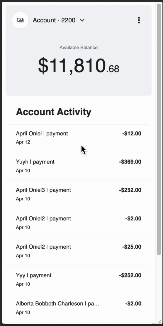
Components working together
Unit web components within the same document can effectively communicate with each other. They can automatically exchange messages and trigger events to update relevant data in other components.
For instance, the Payment components and Activity components can work together such that, after a payment has been processed, the new transactions are automatically displayed on the Activity component.
Similarly, the Payment components and Account components can communicate such that, after a payment has been made, the account balance is updated on the Account component.
In some cases, a component may need to be updated in response to an event that is triggered by another component.
For example, if a customer has multiple accounts, the app may have an Account component and an Activity component that displays the activity of a selected account.
<unit-elements-account account-id="1105561"></unit-elements-account>

<unit-elements-activity account-id="1105561"></unit-elements-activity>
The Account component has an account switcher that can change the current selected account.
By listening to the Account component's unitAccountChanged event, a change to the Activity component can be triggered to display the new account activity.
To accomplish this, the following code snippet can be used:
document
	.querySelector('unit-elements-account')
	.addEventListener('unitAccountChanged', async function (e) {
		const eventData = await e.detail;
		const selectedAccountId = eventData.data.id;
		document
			.querySelector('unit-elements-activity')
			.setAttribute('account-id', selectedAccountId);
	});
Content Security Policy
If you are using a Content-Security-Policy (CSP) header, you may need to extend it to allow the web components and third-party integrations (such as Zendesk and Plaid) to work correctly.
Add the following <meta> tag:
<meta
  http-equiv="Content-Security-Policy"
  content="
    connect-src 'self'
      https://*.s.unit.sh
      https://*.unit.co
      https://*.zdassets.com
      https://*.zendesk.com
      https://cdn.plaid.com
      https://*.au10tixservices.com;
    script-src 'self'
      https://*.zdassets.com
      https://*.zendesk.com
      https://cdn.plaid.com
      https://*.au10tixservices.com;
    frame-src 'self'
      https://*.zendesk.com
      https://cdn.plaid.com
      https://*.au10tixservices.com;
  "
/>

:::tip[CSP and ES Module chunks]
If you are using the ES module build and have a CSP header, make sure your policy allows loading scripts from the CDN domain â the on-demand chunks are served from the same origin under a `chunks/` subpath and need to be permitted.
:::

## Browser Compatibility \{#browser-compatibility}

ES modules are natively supported in all modern evergreen browsers (Chrome 61+, Firefox 60+, Safari 11+, Edge 79+). No extra loader or runtime is required.

For legacy browser support, continue using the IIFE build (`components.js`).